

Content
- Heading
- Heading colored section
- Subtext (no format options)
- Button
- Link
- Button text
- Image
- Add 6 images
Styles
- Predefined background colors:
- Purple
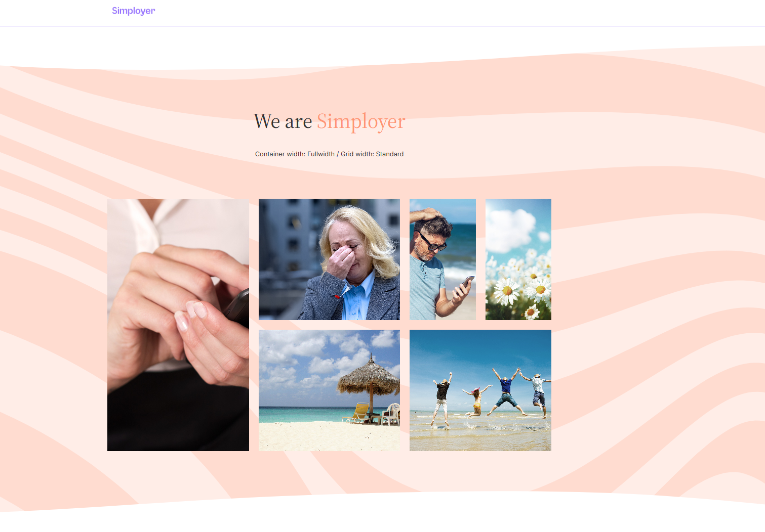
- Orange
- Gray
- The background is available with or without wave patterns + top and bottom wave
- You can adjust the container and grid width. Recommend to use Fullwidth container width and Standard grid width.
Example
Screenshots below illustrates how the module appears on a web page: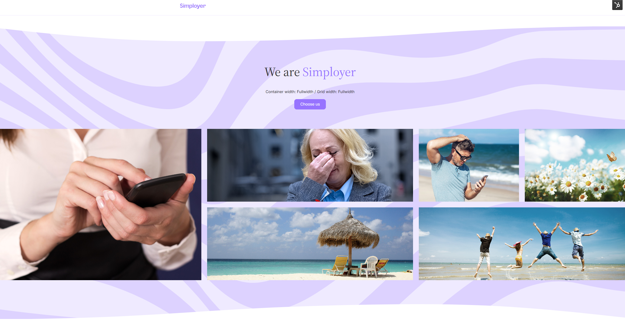
Note
Note that images may shift at different screen resolutions if the grid width is set to Fullwidth (the main object should remain centered in the image).
Be aware that only the Fullwidth container width works well with heading, summary, and button. The grid width can be a bit tricky, so choose Standard if you don’t want to spend too much time adjusting images.
 Get HR news straight to your inbox