

Content
Add multiple Button items containing:- Button text
- Link
- External/Internal
- Open link in new window
Styles
- Button style
- Purple / Light purple / Purple outline / Light purple outline / Orange / Light orange / Link
- Alignment
- Left / Center / Right
- Container width
- Standard / Fullwidth / Smaller / Extra small
- Margin top/bottom
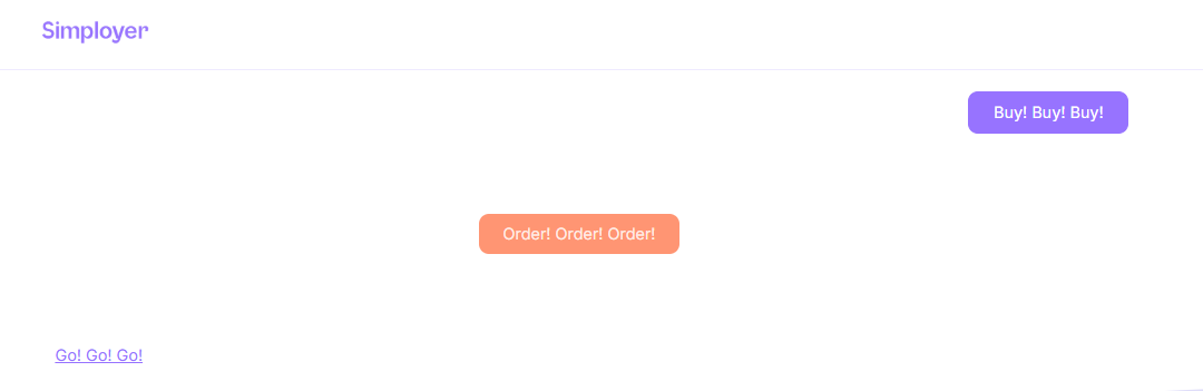
Example
You can see this module in use at the bottom of the page with different styles. Note that this example is from a blog module, where the width is narrower than on standard website pages.
Here’s how it appears on a web page with some of the styling options applied:
 Get HR news straight to your inbox